The unannounced updates to Facebook’s Social Plugins and how to use them!
Jan 11, 2012 · 11 min read · 725 views
Since the launch of platform, Facebook has the approach of shipping features early, very early. They ship first, ask later and document even further later. And I, personally, love them for that. Back in the days you used to find half or non documented features in their API or libraries on a daily basis. Every time you find one of those little gems your product owner brain goes all sparkly and happy, it jumps for joy and you see the future of the web unfolding in front of you. And done right - given facebook’s leverage in size and fast distribution - those little new possibilities usually open huge possibilities for your product. This is the fun part about being on the bloody edge of web innovation.

Move fast, break things and look stupid.
The Open Graph
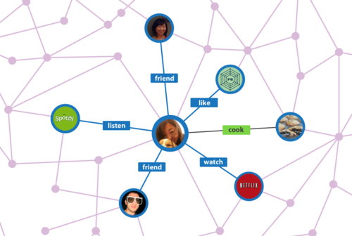
Facebook is building the graph for the social web, the social layer that explains interactions beyond Network, Presentation or Application but People. All technology of the last year leads to new achievements in society – like being able to see who listens to Justin Bieber. This is beautiful.

Tamas insists that someone was using his laptop during that time.
If you are new to this topic - the Facebook Developer Documentation explains the new actions in the Social Graph very well.
The New Plugins
Disclaimer: I tried the plugins, they were not yet fully working. So please take everything with a grain of salt. Keep in mind that the job of the product owner is to think forward and to have everything ready – so that your product will be one of the first to implement.
The new Activity Feed, Facepile and Recommendation Box.
Showing human faces show to a new visitor generic social proof and therefore increases the confidence in your service. If you can show friends you are adding trust and peer pressure into this mix.
Previously you were able to show to new visitors of your site which of your content objects have been liked by their friends. This is great. But to truly leverage this in your product you needed to have the like button as a central part of the product UX. Apart of media services, like newspapers and galleries, the like button never truly got part of a product’s core user flow. Therefore, in most cases, it was just reduced to a (very powerful) friction less version of the share button.
With the Version 2 of the activity feed, facepile and recommendation box you are now able to show the actions that happend within your app. It enables you to show which of the visitors friends actually USED your product or even better specific features of it. Without you actually needing to know anything (especially no register or login) of the visitor.
Facepile - How to use this in Lean Startups.
The old usecase: Call to action for register (or core action of your app).
Example
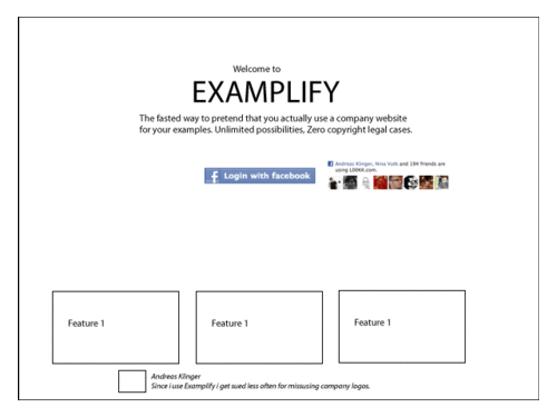
“Hey you, register on Examplify now! 50 of your friends are already using Examplify”
This is nothing new and is easy possible by using the APP ID as parameter for facepile:
Code:
<div id=”fb-root”></div><script src=”http://connect.facebook.net/en_US/all.js#appId={YOUR_APP_ID}&xfbml=1”></script><fb:facepile></fb:facepile>
Main New Usecase:
With the new facepile you can provide the actual content element and the action the user did.
Examples
- Soundcloud: This song has been listened 200 times and among others these friends listened to that song.
- Kickstarter: 400 people pleged, among other these friends.
Why is this useful? If you app is done right, it is highly likely that more people actually use the core of your app than just like it. Eg. More people will listen to a song than “like” one specific song.
This usecase is nice but not ground breaking.
Code:
<fb:facepile href=”http://zhen.myfbse.com/rb-roastchicken.html”action=”og_recipebox:planning_to_make” width=”200” max_rows=”1”></fb:facepile>
Bigger Better Alternate Usecase #1: Campaigns
Example
- Make a marketing campaign where you have to XYZ (e.g. post something on facebook, or spend money for fresh water, play a game, join a activity group, etc).
- Create a verb for that action.
- Create your own landing page for that marketing campaign.
- Show the friends who already did this specific action on that campaign page.
- Bonus points: You can show the friends that started the campaign and the friends that completed the campaign! (Think:“Level 1: Anton Berta Carla, Level 2: Anton Berta, Level 3: Berta - Can you beat them?”)
I am pretty sure for many apps there is something big in here worthy to explore.
Bigger Better Alternate Usecase #2: Upgrades and Pricing for Saas
- Imagine you are Kissmetrics (or any other SaaS).
- Your integration of FB connect is usually limited to fb:login and you want to keep it that way. You cannot be bothered with thumbnails or any other friendgraph information within you MVP - Your focus is not social, but social proof will always help conversions.
- You have people using your test-mode, lowest or free plan.
- You want them to upgrade.
- You want to optimize your conversion on those upgrade pages.
- Show the friends that upgraded to that price stage. If you really want to move the needle - why not just show them on your pricing page below the packages you offer?
- Run it A/B. If it doesn’t increase your upgrade conversion I owe you a beer.
Bigger Better Alternate Usecase #3: Build your own like button - extend your widgets.
- Imagine you are bufferapp.
- When you are done thinking about how awesome that would be think about how to extend your button-widget.
- Not only show the “use-count” also show faces of the friends of the visitor using that app. Add that to your iframe widget and distribute that through the web.
Or:
- Imagine you are Soundcloud (yes… that would be awesome i know…).
- Now extend your player widget by showing who of the visitor’s friends actually played that song.
Or:
- If you are somebody like pinterest.
- You could you can even build your very own like (“pin”) button with the same functionality (towards your platform not towards facebook).
Let’s be honest - this done right - is damn exciting!
Activity feed & Recommendation Box
This is big. Actually bigger than the updates to facepile
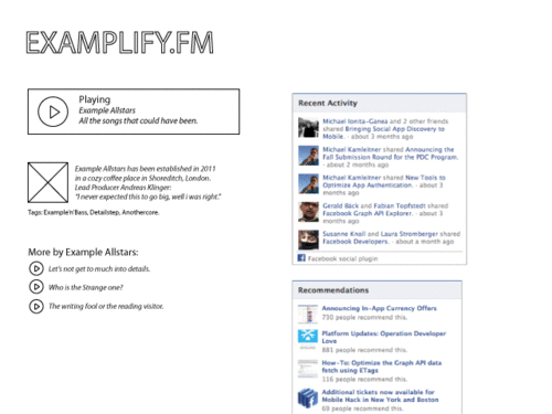
Example Usecase: Music pages
- Imagine you stumble upon an online radio because a friend shared a link– Eg. Mixcloud.com.
- The player is very minimalistic.
- You are here the first time.
- You listen to this new song the first time.
- The webproduct knows nothing about you (you are just a visitor).
- But it is able to show you more music your friends have been listening to.
- Music that you might care about. Even if not. It makes deep content accessible in a (basic but) qualitative way.
And remember: This is happening without you registering. You will continue to engage with that service. And the more you engage the more likely you are to stay sticky to the webservice.
And the big upside: If you do not have friends actually using that website. Recommendation and Activitiy feed have fallbacks and just show you which content elements of the website have been used the most.
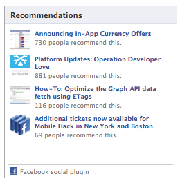
More about the new Activity and Recommendations
Add this to timeline
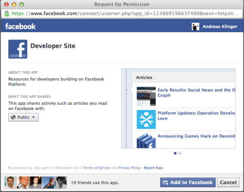
‘Add this to timeline’ is (edit: should be) the new share button.
Since the roll-out of the like-button the sharebutton got less and less focus. Fun fact: Until now (in my experiments) sharebuttons drive more first-time traffic than any like button. Only the upside of the like button of less friction and an open backchannel keeps me using it.
Facebook introduced adding content to the timeline through their JS library at the last f8. If i understand it correctly: The Button is “just” a simple way for content publishers to integrate the same functionality without going mental in understanding what onclick means. And you do not have to authorise the app for that action upfront.
You will still have to add all values to your App settings, but i am pretty sure step-to-step guide will popup within the next 30 days.
But in general the effects as a sum are bigger. It means even small blogs will add customised content to your timeline. The can annotate edges and they can basically very cheaply enrich facebook timelines. Recipe websites can create little timeline gallery of dishes you cooked. From a product view this is beautiful.
Run an A/B – replace your share buttons with Add-to-timeline buttons. Test if people actually get it. If they do, they will create beautiful embeddings in their timeline without actually registering on your site. And more important: by that you can define those edges which you are afterwards are able to reuse with the plugins mentioned above.

Edit
I got some feedback by Simon Cross from Facebook about this part:
We don’t see add-to-timeline as a replacement Share button - add to timeline is technically similar to the login button, in that it shows the auth dialog and lets a user auth the app.
But once a user has added your app to timeline (authd/logged in) then you can publish actions when a user clicks your own native buttons in your site - you can make your native actions social.
If I was designing, I’d put add-to-timeline in the right column and retain a share or like button next to my main content objects. Then I’d wire up Open Graph actions to my site’s native actions too.
I will leave this here for now. I personally disagree with this approach to think about it, but well i guess they know their stuff better ;)
Recommandation Bar
The Recommendations Bar is always docked to the lower right (or left) of the screen. When the page loads the Recommendations bar will be collapsed and the user will have the option to ‘like’ your page.As the user nears the end of your page, the plugin will expand. The expanded view will show the user a social recommendation of the next article to read on your site.
I wasn’t able to get the plugin running but to me it sounds like all those wordpress plugins about sharing. Might be nice but to be honest i am already sick about the dominance in design of the current social plugins. Facebook should rather work access to APIs for anonymous visitors instead of forcing their design patterns like with fb:comments or now with fb:recommendation-bar. But let’s see.
Why is this big for Lean Startups?
The new plugins help you focus on the core of your product. The core you actually want to iterate on.
But still - very cheaply - by using this plugins you are able to provide qualified deep content discovery and can easily offer social proof.
What is missing from facebook
Until now every creation within the Social Graph is meant to generate a visual content in facebook. Or simply put: You “post stuff on facebook” when you want to define edges within the open graph, between (people and) objects.
That’s good from a distribution point of view. That’s bad if your goal is to annotate your namespace of the Social Graph as good as possible. Example if you want to go into details.
I am pretty sure facebook will offer the possibility to create edges without actually posting something to facebook in 4-6 months. For now the usecase isn’t very obvious.
Summary
Facebook completes the circle with those social plugins and proves that they take their approach to the social web serious.
You as a product owner can optimize your product. You can define niches/features. You can personalize your website a step further very cheaply for non-registered visitors while actually focusing on the core of your lean startup.
You can keep users engaged and (hopefully) ultimately convert them.
How would you use those plugins? What obvious usecase am I missing? Let me know! Eager to learn. Please send me your thoughts on twitter or in the comments of HackerNews.
Until then: The web is fun, go play.
— Andreas
