The simplest and most important dashboard for early stage startups.
Feb 24, 2014 · 6 min read · 27,996 views
This blogpost is part of a small series of posts that cover the basics of startup metrics. My personal goal is to help early stage startups more effectively, but also avoid repeating myself too much in mentoring programs.
If you are working on a software product in early stage of its lifecycle this series might be useful for you.
Other posts in this series.
- A primer on startup metrics. Which tools to pick
- Easy, but easy to f*ck up. How and where to integrate Analytics goals
- Startup Metrics: A Love Story. The Slides Of My 7h Workshop
If there are special topics you’d like me to cover please ping me via @andreasklinger. Also if you consider them useful please be so kind and tweet this article.
Early Stage Startup Metrics
One of the most common pieces of advice is that in early stage you want to focus on retention. Because retention - in the end - is a function of customer happiness
retention = f(customer happiness)
It’s simple: If people are not happy with your product and/or gain no benefit by using it they will most not continue using it.
And automatically cool visualisations like retention cohort tables come to mind.
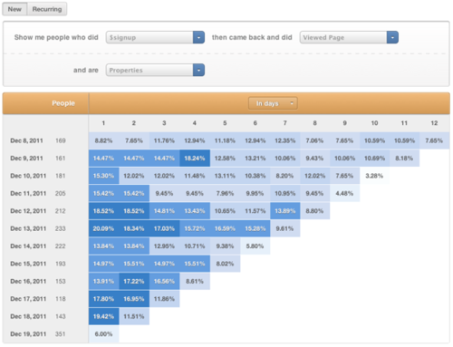
While those tables look nice and give you this nice fuzzy feeling of doing something useful with your time, they are unfortunately usually a bit useless until you get to the point of optimising on-boarding conversions of new users.
Please don’t get fancy too early.
This kind of visualisations are great when you have too many users and need to get a bird eye view. When you need to an abstraction. B2C mobile apps often have this problem already in early stage. But most SaaS companies (or companies still in beta) i worked with don’t have this problem until they reach product market fit.
20% changes with 20 customers won’t tell you much apart of the basics of standard deviation. A personal relationship to this customer will tell you his story. Keep them close.
If you treat your paying customers like percentages and meaningless numbers they will do the same with you.
The one “dashboard” i recommend almost all early stage startups is one they already have. Let’s start using it.
As long as your customer list fits on one or two pages, you should have a list of all those customers. (And i am pretty sure you already do have this in your backend)
Add activity information to this table. Core KPIs that tell their activity level (or at least their last login date). Color highlight it based on activity. And put someone in the team in charge of making sure everyone stays on green.
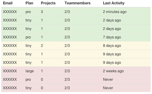 dummy mockup is dummy
Seriously? That has nothing to do with metrics, or?
“That’s the kind of advice gives someone who charges money for consulting? Make him draw complex graphs or bring the pitchforks.”
This dashboard so embarrassingly simple to implement, i was even scared to publish this post. But it is - and keeps being - my most common recommendation for a custom dashboard.
I don’t know about you. But I don’t necessarily need numbers. I need information i can act on. I want product insights - simple ways to use my database information to create actionable insights.
Most abstractions like graphs, retention cohorts, aarrr funnels and so on are great to aggregate information as soon as you have too much of it. Before that they just do one thing, create an abstraction layer.
For myself i found out this is even useful in a bit later stage: If you have only 0 - 100 new signups don’t hide them neither. It’s the same game on a higher level. Their first month is the one month that decides if you will keep them or not. Keep someone in charge of making them stay green.
Put one person in charge of keeping all customers on green. Most likely that person is you.
Your job as a product manager/founder is it to keep in contact with all those customers. And as soon as someone moves to orange contact them via email or skype.
Find out what’s going on. Now they are still in their decision process. Now you still can convince them to stay. Now you might even get useful information for product changes.
Churn is not happening when a user unsubscribes from your service or stops paying you. This is just when you notice it. Churn happens when a user stops using your product. You want to jump in when a customer is at risk, when he might stop using your product.
As long as you have a few dozen paying customers you can contact each one personally. There is no excuse. Don’t treat them as numbers, if you don’t want to be treated the same way.
Customer Happiness Index
If last activity of your customer doesnot mean much for your product (eg login might not mean that he found/did something) you might want to focus on deeper core activities.
Usually people create a Customer Happiness Index. A single number that combines all done activities to a sum, while giving each of those activities a weight.
By doing that you can eg. say that logins are less important to you than purchases. You can even aggregate those numbers in groups and through that see problems in certain segments of your user-base.
But to be honest, as fancy this is, i hardly ever need this.
Not until i need to aggregate those numbers. Eg show the customer happiness of a certain customer segment.
But until then - in my personal experience - i usually only see 1-3 core activities in a product. (eg in a project tool - number of projects/total, todos-closed/week, active-team-members/week) And normally i tend to simply recommend adding those numbers to the table and be done with it.
Commercial break.
One product i want to highlight at this point is Intercom. They basically offer this as a service, but add manual and automatic messaging. Additionally they write one of the best startup product blogs out there
But as long as you need/want to save a bit of money. The table mentioned above is only a few lines of code away.
until then, get your product moving,
Andreas